Cinesta App
Cinesta is the ultimate all-in-one movie theater app that allows users to check availability, purchase tickets, order concessions, and check in all from their mobile devices. By simply creating an account users have the world of cinema at their fingertips.
My role:
Founder, UX Designer, UX Researcher
The problem:
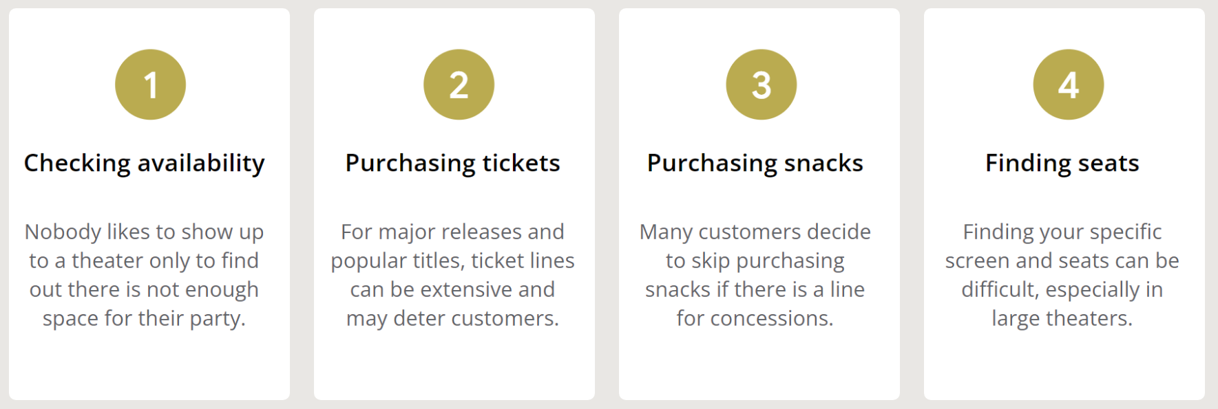
Everybody loves seeing a new movie in theaters while enjoying their favorite snacks, but nobody wants to have to wait in long lines to get their ticket and concessions.
Timeline:
Spring 2022
The goal:
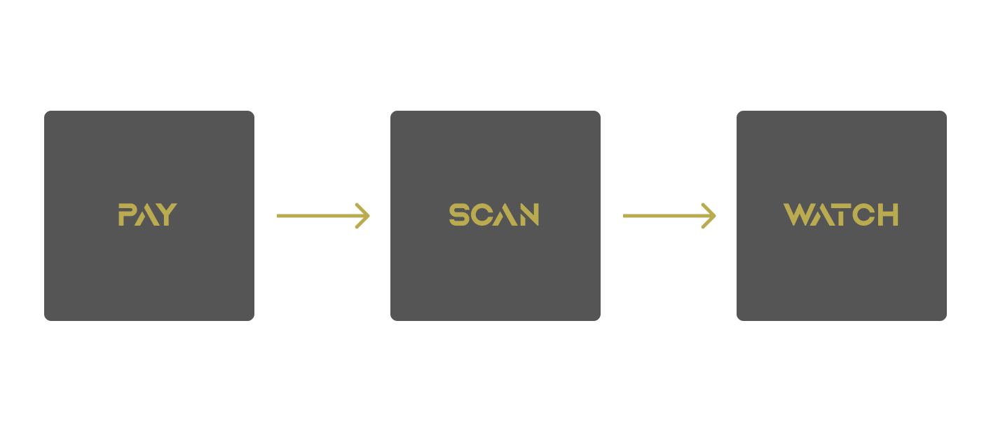
By designing an all-in-one app that allows people to purchase movie tickets, check in for their movies, and order snacks remotely, customers will be able to take care of everything beforehand and skip any dreaded lines.
User Research
Summary:
I conducted several interviews with friends and family regarding their experience attending movies in theaters and asked for their opinions about a mobile app that gave customers the opportunity to remotely purchase movie tickets and snacks to avoid waiting in lines. While I somewhat expected everyone to be in favor of this concept, I was surprised to find out that one person was not interested in using it personally. One of the participants held privacy in very high regard and does not like to download third-party apps that may access sensitive personal information.
Along with this, they were worried that downloading this app may result in slower operating speeds for their device, further making them uninterested in using the app. With this said, all of the users agreed that there is certainly a market for this type of application, and all but one said they would prefer using it over conventional methods. This was all I needed to prompt the first steps into designing the Cinesta app.
Pain points:
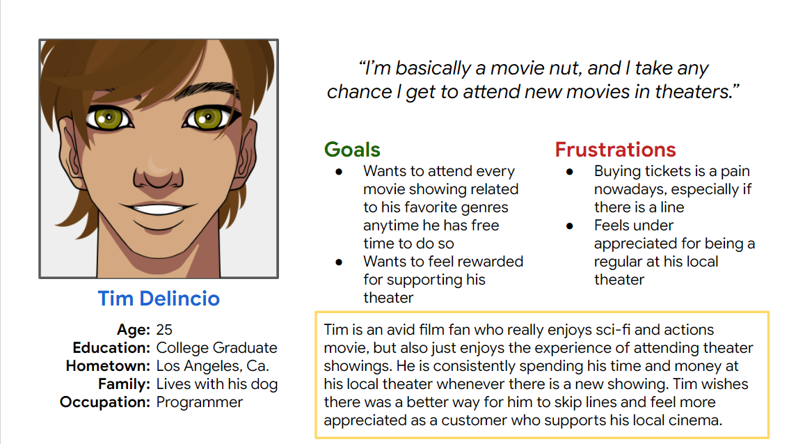
Personas:
Design Phase
Summary:
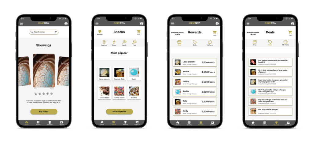
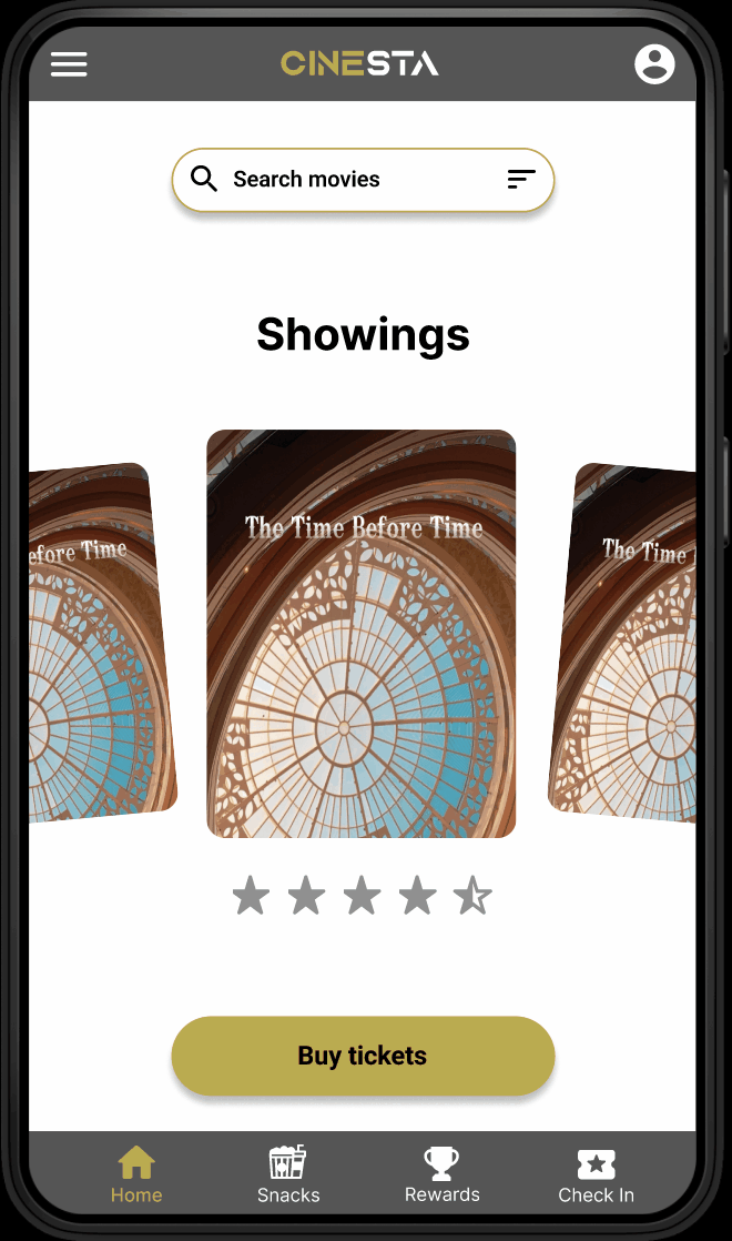
When I began brainstorming possible home screens, I wanted to consider multiple layouts to get an idea of how each one would look. In the end, I decided that having a large carousel on the home screen would properly display each movie without feeling overwhelming or bare. This would maintain an informative, no-nonsense layout without feeling too cluttered or confusing. I also added a Top Movie section to display the highest-grossing movie at the time.
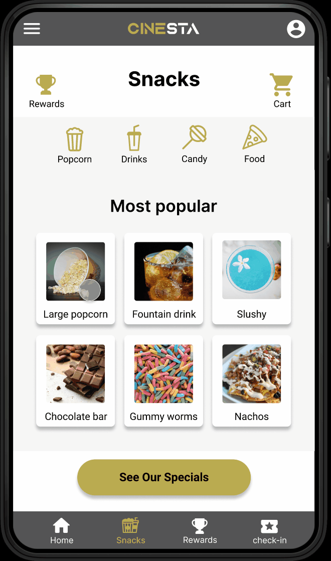
This would likely get frequent use as the majority of people looking for tickets will be wanting to watch the most popular movie at the time. For the snacks flow, I wanted to make buying snacks both intuitive and attractive. I came up with the idea of using a most popular section to recommend common snacks to the user, combined with a navigation bar to allow users to sort by the type of snack they desire.
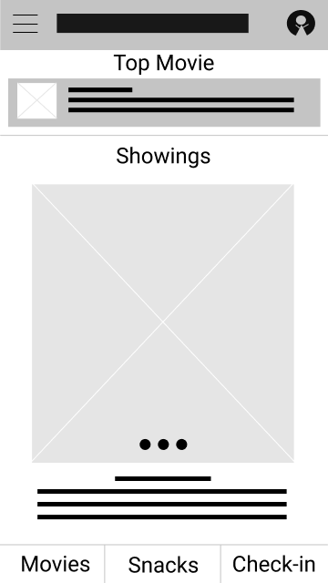
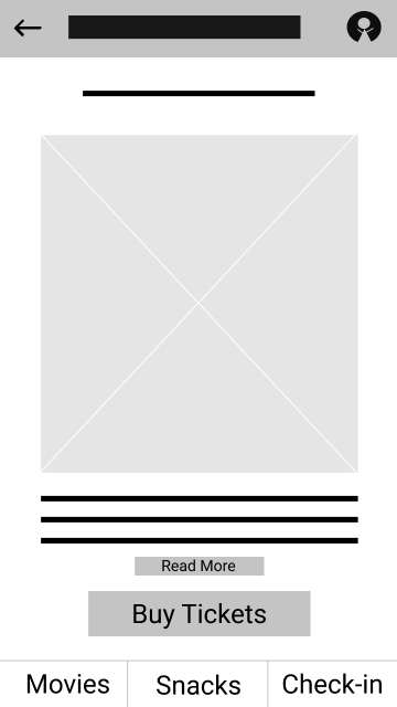
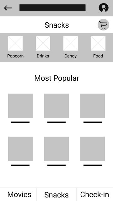
Paper Wireframes:


Digital Wireframes:
High-fidelity designs:
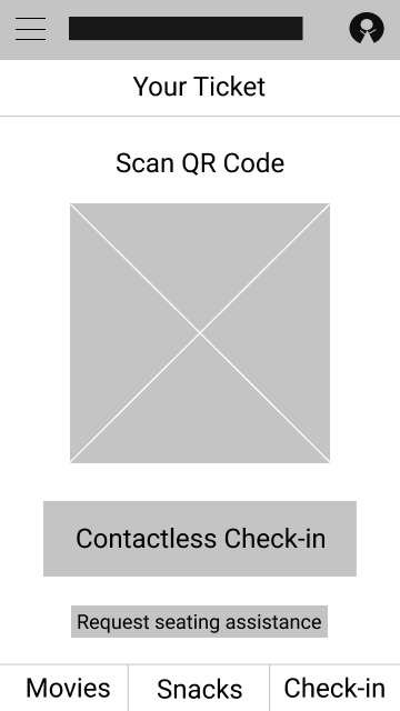
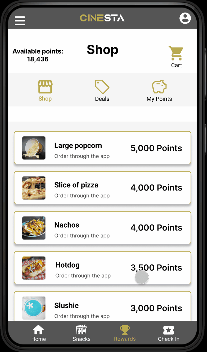
Once I had combined my low-fidelity mockups into a functional prototype, I gathered five of my friends and family and had them test out my prototype. During the first round of user testing, the focus was on ironing out obvious flaws in user flows. The second round of user testing identified quality of life aspects that could be improved, such as labeling the cart and setting the reward shop as the rewards home screen for ease of use. Some of the main issues that were identified included confusion while using the rewards tab, no seating selection screen, a party size feature that was confusing to users, and a cart button that was easy to miss.
To address these issues, I set the Store to be the Rewards home screen, changed the name to Shop to make it easier to spend points, and made the cart button an icon in the upper right region of the screen to make it easier to locate. I also added a seating selection screen that would double as a way to select how many tickets a user plans to purchase. With these pain points addressed and the low-fidelity prototype working exceptionally, I added color, text, images, and other visuals to create a high-fidelity mockup of the Cinesta app.
Mockups:


Prototype:
Conclusion
Takeaways:
Throughout the creation of the Cinesta app mockup, I have learned countless skills related to designing a useful, effective mobile application. Between user research, brainstorming, wireframing, and prototyping I have experience with every aspect of the design process and have a firm grasp on what it takes to make an excellent application. I have also learned a great deal about designing with accessibility in mind, and why it is so important to make products that work for users regardless of their circumstances.
Some of the accessibility considerations built into the Cinesta app include the ability for users to request seating assistance after purchasing their ticket, labels for all buttons for improved functionality with screen readers, and a color scheme that meets WCAG standards for contrast and ease of reading to ensure a natural, comfortable user experience. This means that Cinesta is designed to cater to the elderly, handicapped, vision impaired, and individuals with color blindness.
Next steps:
With the Cinesta mockup finalized, it is time to consider the next steps for the app. The first thing that must be done to further the experience for mobile users is to design responsive resizing for larger mobile devices. After that, pitching the app to a cinema company would be the best way to get Cinesta on the market and in the hands of users. The combination of ease of use and promoting the purchase of snacks using the rewards program would likely increase business and sales for the company.
If Cinesta were to catch the attention of investors it would be time to hand the design off to developers to be made into an official app. This process would include getting the rights to the name Cinesta and beginning to establish a brand identity through a website, advertising, and other media outlets. By taking these steps, Cinesta would be a full-fledged theater app that would improve the lives of many by providing stress-free access to entertainment.